5 Most Common WCAG Violations on College Sites
The five accessibility violations we find most often on higher-ed websites, what each breaks, how assistive technology users hit them, and how to fix them.
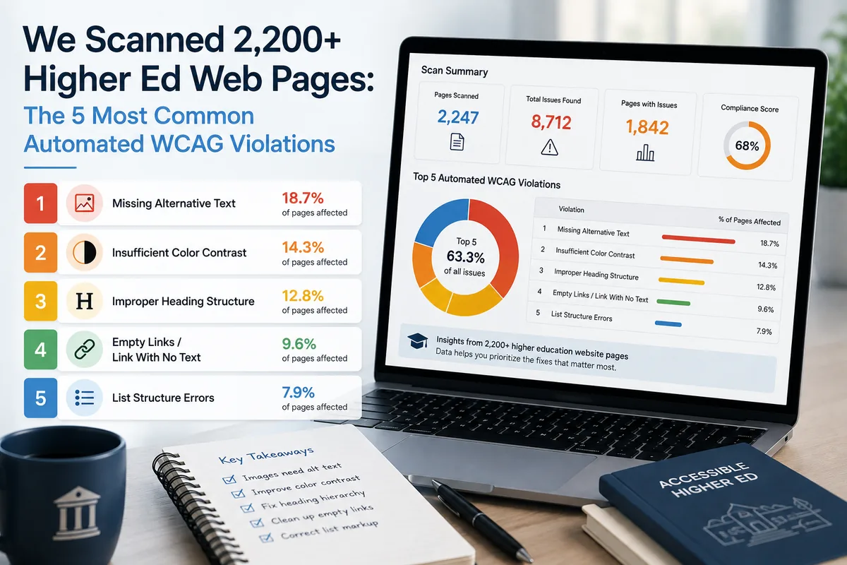
Most higher-education websites do not fail accessibility in unusual or creative ways. They fail in the same five ways, and the reasons are structural: a brand palette chosen before anyone tested it for contrast, a page builder that emits invalid ARIA, a theme with no main landmark, and a decade of content published by dozens of departments with no shared standard.
That predictability is good news. Five patterns account for most of what we find, and all five are detectable by automated scanning and fixable at the template level.
The short answer
The five most common WCAG violations on college websites are broken ARIA from page builders, missing structural landmarks and duplicate navigation labels, brand colors that fail contrast, unlabeled interactive elements and images, and heading-order skips in content. Every one is machine-detectable, and every one is a template or design-system problem more often than a per-page content problem, which is why fixing them at the source clears them in bulk.
The five, at a glance
| Violation | WCAG criterion | Who it affects most | Fix approach |
|---|---|---|---|
| Broken ARIA in page builders | 4.1.2 Name, role, value | Screen reader users | Correct or replace the builder component |
| Missing landmarks, duplicate nav labels | 1.3.1 Info and relationships, 2.4.1 Bypass blocks | Screen reader users | Add <main> and name each <nav> in the theme template |
| Brand color contrast failures | 1.4.3 Contrast (minimum), 1.4.11 Non-text contrast | Low vision users, anyone in bright light | Darken tokens in the design system |
| Unlabeled controls and images | 1.1.1 Non-text content, 4.1.2 Name, role, value | Screen reader users, voice control users | Template defaults plus a CMS field that requires alt text |
| Heading-order skips | 1.3.1 Info and relationships, 2.4.6 Headings and labels | Screen reader users navigating by heading | Editor training plus a heading component that enforces order |
What the public data says
Before the higher-ed specifics, it is worth anchoring on the web-wide baseline, because the pattern is not unique to colleges.
WebAIM’s annual analysis of the top one million home pages, run in February 2026, found detectable WCAG failures on 95.9 percent of home pages, averaging 56.1 errors per page, up roughly 10 percent year over year. Six failure types accounted for 96 percent of all errors detected:
| WebAIM 2026 failure type | Share of home pages |
|---|---|
| Low contrast text | 83.9% |
| Missing image alternative text | 53.1% |
| Missing form input labels | 51.0% |
| Empty links | 46.3% |
| Empty buttons | 30.6% |
| Missing document language | 13.5% |
Map those onto the five categories below and the overlap is nearly total. Low contrast is category three. Missing alt text, empty links, and empty buttons are all category four. Missing form labels is category four as well, and often category one when a builder generates the form. The higher-ed pattern is the web-wide pattern, concentrated by the fact that institutional sites are large, old, and edited by many hands.
Our own aggregate is a complementary data point. Across more than 2,200 higher-education pages we scanned, pre-remediation grades averaged in the D to B range, with the spread driven mostly by how much of the site ran through a modern template versus older standalone pages.
1. Broken ARIA in page builders
Breaks: 4.1.2 Name, role, value.
Page builders generate a lot of markup, and a meaningful share of it carries ARIA that is wrong rather than missing. Common shapes: aria-expanded on an element that expands nothing, a role that contradicts the underlying element, aria-labelledby pointing at an ID that does not exist on the page, or nested interactive controls that produce an impossible accessibility tree.
How it fails users. Invalid ARIA is worse than absent ARIA, because it actively lies to assistive technology. A screen reader announces a control as a collapsed menu that never opens, or reads a label that is not there. The user is not confused by a missing feature, they are misled about what the interface is.
How scanning detects it. Automated accessibility tools evaluate ARIA against the specification’s rules: whether a role permits a given attribute, whether referenced IDs resolve, whether required attributes for a role are present. These are deterministic checks, so this category has a very low false-positive rate.
How to fix it at the source. Configure the builder module correctly, update it if the issue is fixed upstream, or replace the component with a documented pattern from the W3C ARIA Authoring Practices Guide. Patching the output with JavaScript after render means re-patching after every builder update. We walk through the template-level approach in fixing WCAG violations site-wide with a WordPress child theme.
2. Missing structural landmarks and duplicate nav labels
Breaks: 1.3.1 Info and relationships, and 2.4.1 Bypass blocks.
Two related problems. Many themes never wrap their content region in a <main> element, so there is no content landmark. And most institutional pages carry several <nav> elements, a primary menu, a utility bar, a footer menu, an in-section sidebar, with no accessible names on any of them.
How it fails users. Screen reader users navigate large pages by landmark, the same way a sighted user scans for the content column. With no main landmark there is nothing to jump to, so the user tabs through the entire header on every page. With four unnamed nav regions, the rotor lists “navigation, navigation, navigation, navigation” and the user has to enter each one to find out which is which.
How scanning detects it. Presence of a main landmark, and uniqueness of accessible names among same-role landmarks, are both structural checks a crawler can evaluate on every page.
How to fix it at the source. Add <main> to the theme template, and give each navigation region an accessible name in the template rather than after load. Both are small template edits that apply site-wide immediately.
3. Brand colors that fail contrast
Breaks: 1.4.3 Contrast (minimum) for text, 1.4.11 Non-text contrast for UI components and graphics.
This is the highest-volume category on nearly every site we scan, and WebAIM’s 83.9 percent figure says it is the highest-volume category on the web generally.
The cause is almost always the same. A brand palette is designed for logos, signage, and print, where it works. Then it is applied to body text, link text, and button labels on white, where a mid-tone color lands somewhere near 3:1 against the background. WCAG 2.1 AA requires 4.5:1 for normal text and 3:1 for large text.
How it fails users. Users with low vision, reduced contrast sensitivity, or age-related vision changes cannot reliably read the text. It also fails anyone using a laptop outdoors, which is a useful reframe when persuading a marketing stakeholder who is attached to the palette.
How scanning detects it. Contrast is arithmetic. A tool computes the ratio between the resolved foreground and background colors and compares it to the threshold, so detection is exact for solid backgrounds.
How to fix it at the source. Darken the token, not the individual page. As a generic example of the math, a mid-tone orange near #f59e0b sits around 2.2:1 on white and fails; darkening it toward #b45309 reaches roughly 4.7:1 and passes, while staying recognisably the same hue. The equivalent move on a light teal near #14b8a6 is something like #0f6b6b. Those are illustrative values, not a prescription: check your own palette with a contrast checker and change the design token so every component inherits the corrected value.
Worth noting for stakeholders: this almost never requires abandoning a brand color. It requires a darker variant of it for text use, alongside the original for large display type and non-text uses where the threshold is lower.
4. Unlabeled interactive elements and images
Breaks: 1.1.1 Non-text content for images, 4.1.2 Name, role, value for controls.
Three shapes dominate: images with no alt attribute at all, icon-only buttons and links with no accessible name (WebAIM’s “empty links” at 46.3 percent and “empty buttons” at 30.6 percent), and form inputs whose visible label is not programmatically associated with the field (51 percent).
How it fails users. A screen reader reaching an unlabeled button announces “button” and nothing else. An unlabeled form field announces “edit text”, so the user must guess what to type. Voice control users are affected too: they cannot say “click apply” if the control has no name to match. And an image with no alternative text is either skipped or read as a filename.
How scanning detects it. Presence of an accessible name from any valid source, whether alt, aria-label, aria-labelledby, an associated <label>, or inner text, is a structural check. Note the limit: a tool can confirm alt text exists, but not whether it is meaningful. alt="image1.jpg" passes the automated check and fails the user.
How to fix it at the source. Two layers. In templates, ensure components that render icons require a name. In the CMS, make the alternative text field required for content images so the problem stops being reintroduced. Then handle the existing library as a content project, prioritising images that carry information over decorative ones.
5. Heading-order skips in content
Breaks: 1.3.1 Info and relationships, with 2.4.6 Headings and labels as the related quality criterion.
A page jumps from <h2> to <h4>, or a template hard-codes an <h3> for a widget title that visually sits above an <h2>. On department pages edited over many years by many people, heading levels usually reflect the size the author wanted rather than the structure of the document.
How it fails users. Heading navigation is the primary way screen reader users skim. A broken hierarchy makes the page’s outline unreliable, so a user cannot tell whether a section is a subsection of what came before or a new top-level topic. It is the equivalent of a table of contents with the indentation randomised.
How scanning detects it. Level sequence is checkable per page: a tool flags skipped levels, multiple <h1> elements, and empty headings.
How to fix it at the source. Fix the template-generated headings first, since those repeat everywhere. Then give editors a heading component that offers the correct next level rather than a free choice of size, so the structure is enforced rather than remembered. Content remediation is the long tail here, and it is genuinely a training problem as much as a technical one.
The honest limits
Everything above is machine-detectable, which is precisely why these five dominate scan results. That is a selection effect worth naming.
Automated tools reliably catch these programmatic categories. They cannot evaluate every WCAG success criterion. Whether alternative text conveys what the image actually communicates, whether reading order makes sense in an unusual layout, whether an error message explains how to correct the problem, whether a custom widget is genuinely operable end to end with a keyboard, all still require a person. The W3C puts it plainly in its guidance on evaluating accessibility: “no tool alone can determine if a site meets accessibility standards. Knowledgeable human evaluation is required to determine if a site is accessible.”
So read this list as the high-volume floor, not the whole obligation. Clearing all five materially improves the experience for real users and removes most of what an automated audit will surface. A full conformance claim needs manual testing alongside it.
The deadline context matters too. Under the Department of Justice Title II rule, public entities serving 50,000 or more people must meet WCAG 2.1 Level AA by April 26, 2027, and smaller entities and special districts by April 26, 2028, per the DOJ fact sheet on the web and mobile app rule. Public colleges and universities are covered.
Finding them, then fixing them
Two different jobs, done by two different things.
GuardGrid finds and proves. It crawls every page, tests against the WCAG success criteria, names the exact failing element and the criterion it breaks, shows each violation marked in place on a screenshot of the page, tracks findings from open to fixed with re-scan verification, and generates dated evidence including a VPAT 2.5. It does not rewrite your code or push changes into your CMS.
The fixing is human work. When your team does not have capacity for it, our ADA compliance remediation service puts College Inbound and Revion Solutions engineers into your templates and content to make the corrections and verify them.
To see which of these five your own site has, and in what proportion, run a free scan. If you already know and want the template-level playbook, start with fixing WCAG violations site-wide with a WordPress child theme. And if you are still deciding what kind of tool you need, we set out the categories honestly, including where we are not the right answer, in our comparison of ADA compliance tools.
Frequently asked questions
What is the most common WCAG violation?
Low-contrast text, by a wide margin. WebAIM's February 2026 analysis of the top one million home pages detected it on 83.9 percent of them, ahead of missing image alternative text at 53.1 percent and missing form input labels at 51 percent. Higher-education sites follow the same pattern, usually because a brand palette was chosen for print or for logos and then applied to body text.
How many accessibility errors does a typical page have?
WebAIM detected an average of 56.1 errors per home page in February 2026, up about 10 percent from the previous year. That figure counts only automatically detectable failures, so the real number including judgement-based criteria is higher.
Do automated scans catch every WCAG violation?
No. Automated tools reliably detect the programmatic categories in this article, which is where most of the volume sits, but full conformance also depends on criteria that require human judgement. The W3C states plainly that no tool alone can determine whether a site meets accessibility standards. Treat automated scanning and manual review as complements.
Which WCAG version applies to a public college?
The Department of Justice Title II rule names WCAG 2.1 Level AA, with compliance dates of April 26, 2027 for public entities serving 50,000 or more people and April 26, 2028 for smaller entities. WCAG 2.2 is backward compatible, so testing against 2.2 AA also satisfies 2.1 AA.
Where should we start if the finding list is thousands of items long?
Sort by severity and by reach, then fix at the template level first. A contrast failure in a shared button component appears on every page that renders the button, so correcting it once clears an enormous share of the list. One-off content issues come after the structural work.